ShopDreamUp AI ArtDreamUp
Deviation Actions


Comments26
Join the community to add your comment. Already a deviant? Log In
You get this critique thanks to the "Critique me" folder of the RisingArtists group.
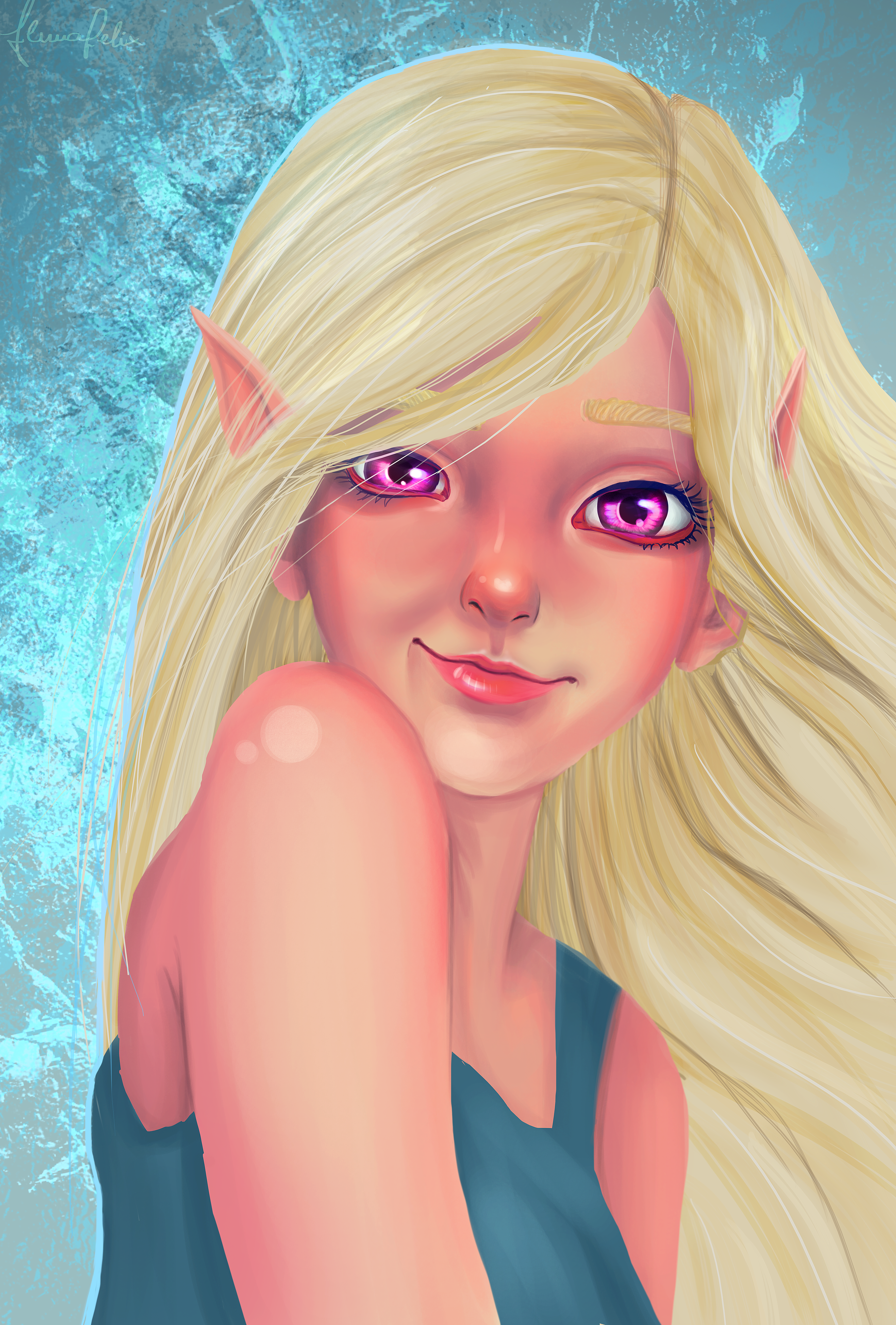
The proportions and shapes are very nice for this kind of semi-realistic semi-cartoon drawing. You have to look closely to find oddities, like the fact the left eye is weirdly half-closed (maybe that's on purpose), the pupils have different sizes (then again, maybe on purpose), and mostly, because it's unclear whether the hair falls behind or on the left shoulder, it looks a bit like she has a dislocated shoulder.
The picture is very cute and nice to look at at first glance. This is to me thanks to a few things. First the pose is adorable, as well as the expression on the face. The eyes are eye-catching thanks to the high level of detail and contrast, they're immensely saturated which makes them vibrant. The face is the second thing you look at, and the colours are nicely blended. The skin is nicely shaded and highlighted with different hues, which makes it more lifelike. The nose tip is slightly red which is adorable. The shading makes the volumes appear clearlybut some slight improvement could make it more realistic. I think deciding on a light source and using that as a guide would help you achive better shadows and highlights. The lightest part of the face here is the chin (!) but the light is clearly not coming from underneath. The hair should cast shadows on the skin, which makes it sometimes look weird.
The composition is nicely worked out.
The colours work really nice together in this picture. The golden hair contrasts nicely with the blue shirt and background, making the piece lively. I like the skin tones that aren't monochromatic. The only thing I don't like is the colour of the eyes which to my mind breaks the harmony. It's catastrophically saturated. Something less flashy, closer to your darker skin tones for example, would, I think, have made a better job. Keep the contrast of the eyes though, it's beautiful.
As for the details, I think the eye brows could do with more work. Real eyebrows aren't blocks of hair. They blend with the skin. That's especially true of blond eyebrows.
Last of all, the background. I like it's colour. I also like the way it gives the picture a dynamic look thanks to its high contrast and gritty texture. However, as a general rule, you should avoid having a background with more detail than your subject because detail draws attention and you want the viewer's attention on the subject. A simple way to avoid this is using a basic blur filter on your background layer. This has the added benefit of adding to the depth of your image.
Anyway, a nice job overall. Happy painting <img src="e.deviantart.net/emoticons/r/r…" width="15" height="15" alt="